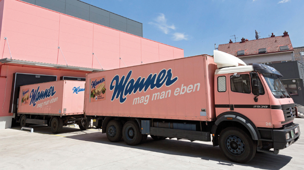
Austria is sadly speaking from an international Marketing/Advertising perspective seen, a no-wheres land with not much brands and campaigns that gain the adland communities attention. Besides Red Bull (yes this is a company/brand situated in Austria) there are only a few brands that have reached a broad distribution that some might notice it in the wild. One of those rare brands is the very traditional sweets producer Manner. It is a iconic brand with brand recognition >90% with a long history, an own copyright protected pink tone as a part of a distinctive asset and also a logo that wasn’t touched for decades.
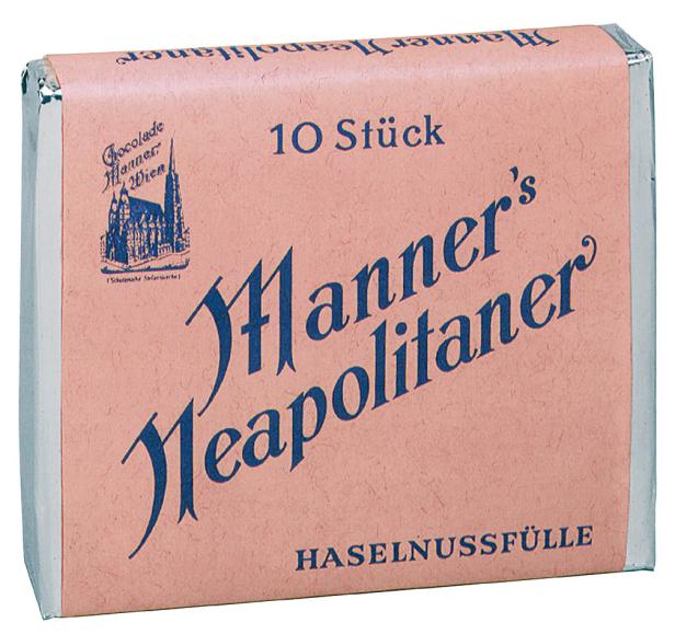
Most popular product is a waffle filled with multi layers of hazelnut cream that is simply called “Manner Schnitten”. A long side with the iconic logo, the unique pink tone comes a long enduring slogan “Mag man eben” which roughly translates into something like, you just like them. So this entire brand is rather popular abroad and it is besides Red Bull the only product from my home country I can recognize when traveling far away from home. In a recent campaign the stick with logo and color but ditched their claim for a new one that means “joy connects”. But lets take a step back before looking into the work and recall the history of this brand.
The long history of Manner
Manner was found 1889 and produced all kind of sweets and sugary products. Also the iconic waffle is very old and has since the beginning the iconic pink tone in the packaging.
The logo changed a bit over the years but as long as I can recall it was in the current version. I think for a long period the brand was treated like the jewel it still is and was only adapted gently and thoughtful. When visiting the city of Vienna there is a flagship store in the most touristic area of the town and to bring Manner products as a gift from Vienna is a very typical thing. The brand has established it so much in the heart of Vienna that it is a cultural part of it. And how many brands can say that to be so closely related to their city of origin. Anyhow the plot twist now, with a new communication platform launched this year that brings in a new slogan and ditches the iconic one to the side.
A new campaign and slogan for an iconic brand
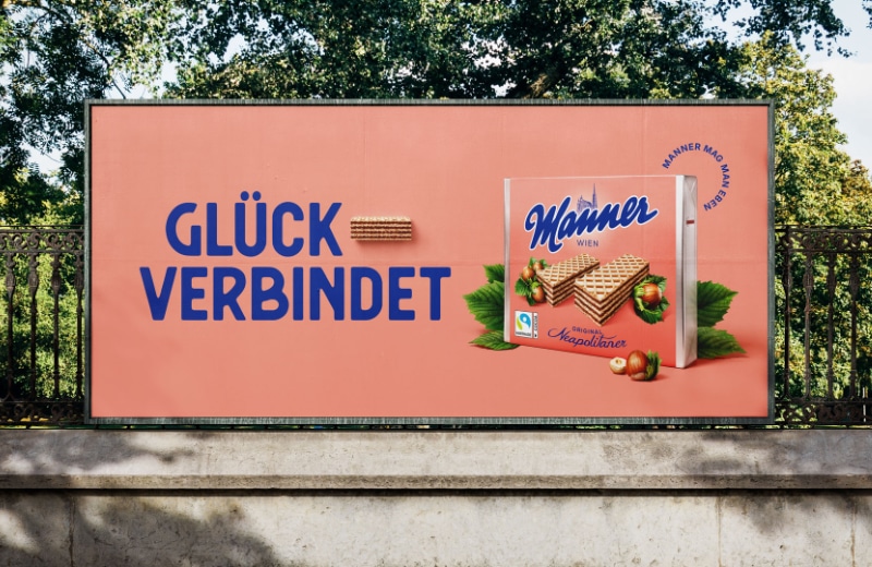
Above you can see the billboard for the newly launched product campaign in the center the new claim “joy connects”. The old/other claim “Manner mag man eben” has become a side letter and is only super small visible next to the packaging. On some ads the original claim is complete gone. It is not fully clear what is what anyway. At least they stick with the distinctive brand color and the packaging.
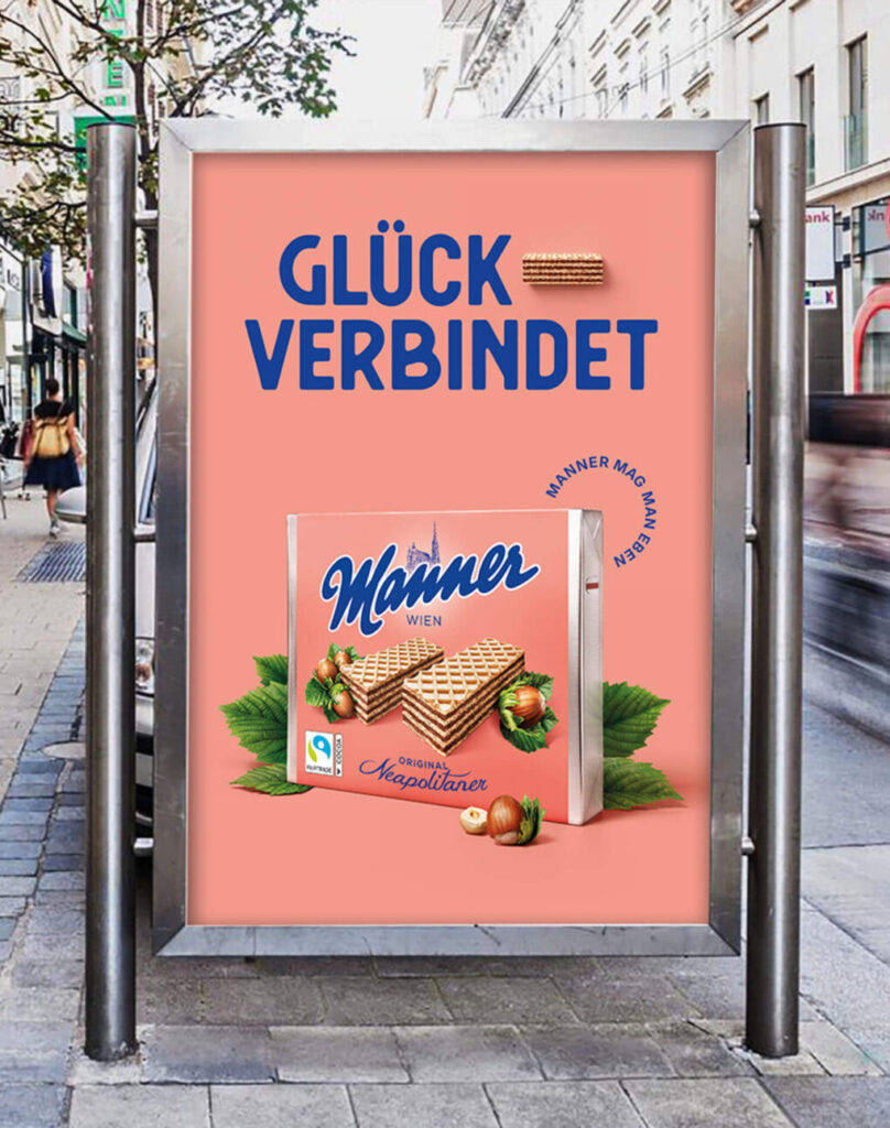
A few words also commenting the new claim: “Glück verbindet” or translated “joy connects” is something so generic and so off the category topic (which could also be a good thing) but here it just feels so off-placed and a typical wanna be purpose statement. There has been a lot said about purpose in business and communication and we saw a trend towards it, now again away but here the nuance is 100% late to the purpose party. Honestly I would be very thankful if someone could explain the strategic thinking behind this, because I cant see any besides we wanna do something with purpose.
Consistency and the negative effect of short handed changes
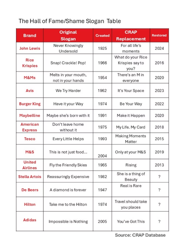
Anyhow, this article is not about purpose in communications but about slogans and broader brand consistency. There was a recent article by Mark Ritson in thedrum which was exactly pointing out this topic of short term, inconsistent brand changes that brought popular brand into serious crisis and most of them reverted their decision. He listed a great summary of brands with that move:
But back to our iconic Austrian brand Manner, the change/campaign with the new slogan just launched this summer and I cannot tell if they feel any drawback so far. Anyhow the game they are playing is a super risky one, and could be as well very expensive. The brand value that was built up since centuries can be seriously damaged on the long term. Looking at the super successful global brands there is the prove that consistency wins over originality, Zeitgeist or whatever you wanna call it (there is also super research from System1 on this matter).
Best example is Coca Cola and Pepsi: One changes its logo, its products constantly over time, the other not so much and kept the logo almost unchanged. Pepsi wins every blind taste test, so they have also the better product, but the winner in the category is Coca Cola and the brand consistency is definitely one important aspect in their brand success story.